Sho.com Styleguide

Highlights
- Implemented a library of 100+ reusable components, accelerating development by 2-3x.
- Evangelized modern, component-based approaches to frontend development inside and outside the engineering group.
- Set up monorepo architecture, dependency management for the design system, and static site generation for the documentation hub.
About
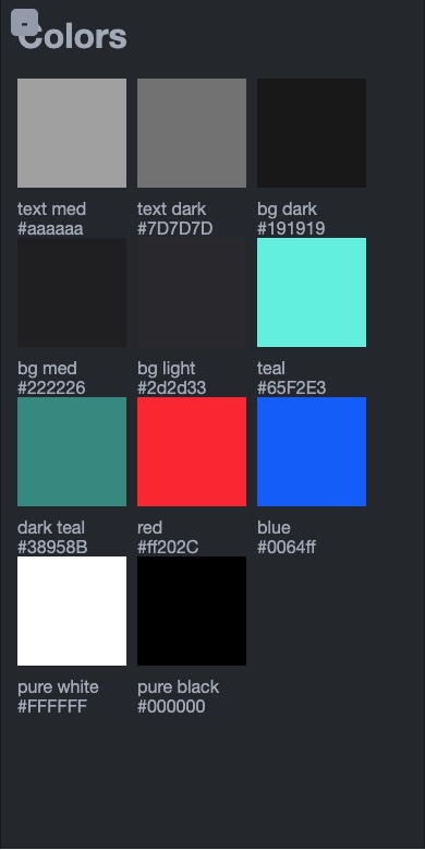
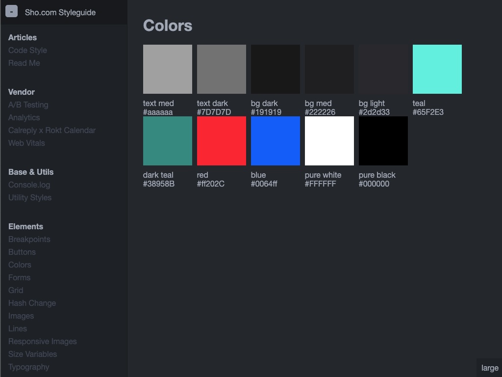
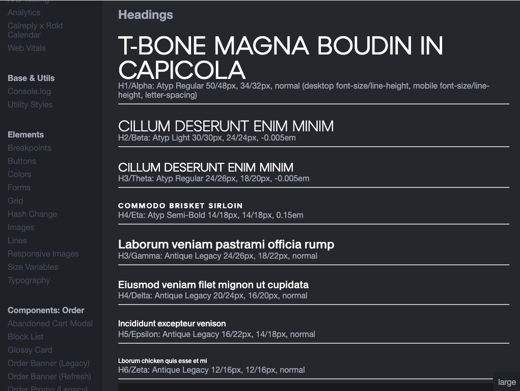
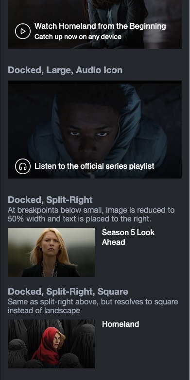
The sho.com Styleguide was the internal site for cataloging the component library and Design System that powered the marketing site. It served as a living documentation hub for showcasing components, patterns and primitives, providing context and examples of how to use the system, similar to how Storybook is commonly used today.
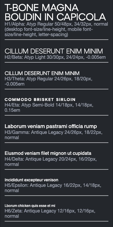
The Design Tokens are defined as SASS variables, with everything from colors and typography to dimensional units defined in their own distinct layers. JavaScript is applied at the component level, meaning that developers can scale up complexity as needed, applying simple behaviors with vanilla JS/ES6+, or by writing more complex components in React. Each component or primitive has its own directory containing the css, html and optional js source files, as well as a markdown file which houses the documentation and article-style content. This provided a lot of flexibility for creating the styleguide, by wrapping the markdown files in their own presentation layer and coercing them into a static site with Metalsmith.
There were two different contexts that consumed the Design System, but it was crucial that we be able to work on them both in parallel, and that changes to the system propagate across the consumers as quickly as possible. These were the styleguide, and the public-facing marketing site (Sho.com). I ended up going with a simple approach where the design system dependency was sym-linked into these contexts, providing an entrypoint that we could import normally. I wrote some npm scripts for managing the sym-links, and we used webpack for our build process and for the local dev server. An integration with Git hooks allowed us to deploy the styleguide site up to production with every change, keeping the documentation and references current.
Crucially, this gave us a single source of truth, ensuring that changes to the component definitions were available in both the marketing site and the styleguide/documentation hub while working. When we later had to introduce another brand as a consumer of the design system with its own theme, the 'poor-man's monorepo' architecture held up.
Tags
Links
Related Projects
Contact
I'm always interested in connecting with other Software Engineers, Designers, Product/Engineering Managers, and I am currently seeking a new role. If you think there might be a fit on your team, you have a question, or you just want to say hi, hit me up!